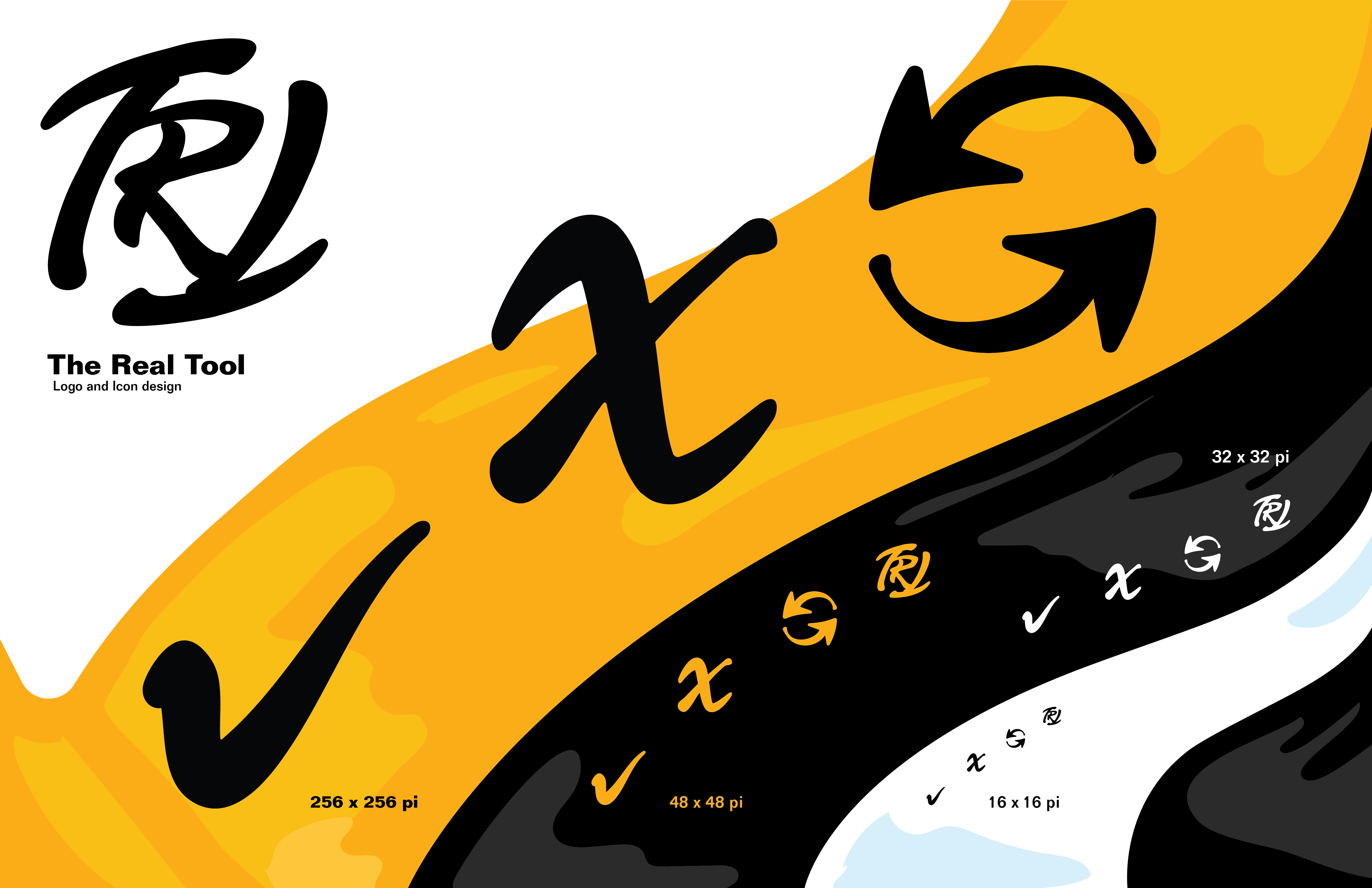
My Latest piece of design work was or a computer programmer in the GTA. He created a time saving program tool for his workplace and needed a logo and icon design for it. The Icons needed would include ones for actions and to close or delete and refresh information. The concept was named The Real Tool, but the remainder or the design concept was left to me.
The Logo

Icon Design

I drew inspiration from ink brush strokes for the shape and flow of the icons. I tested and altered designs until everything was clearly visible at at all sizes. I chose an energetic orange, black and white for best visibility on both standard and dark mode applications.
The client enjoyed the concept and reported it worked well in his program. It was a great experience!
Contact me if you’re looking for any design services. You can find me on all of the platforms below, or message me on WhatsApp.

