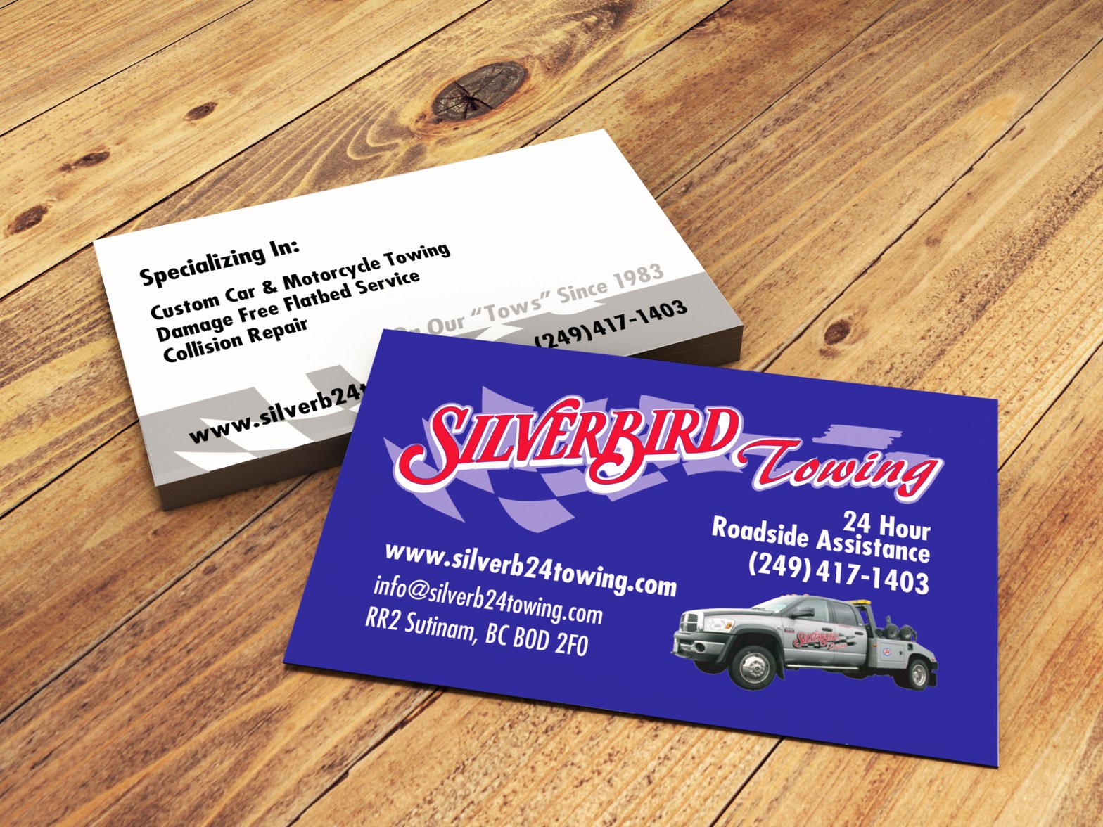
I had the pleasure of working with a very reputable company in my region that offers towing services and collision repair. The company commissioned me for a business card and provided me with a image of their beautiful truck and their retro logo. I was loving the fact that they often help people with motorcycles, show cars and racing vehicles. Super cool!
The logo and type face had to be recreated because the owner couldn’t find the original design files. I recreated the logo and made it vector. I also cleaned up the image provided of their beautiful truck to then be used in the card front.
I stuck to a colour that really popped that they use in their branding as of now. Simple shape work and text formatting to keept the card looking clean and professional. This business also offers auto body services and they hopped to highlight that in some way. I suggested choosing a double sided card design so we could offer details about all their services on the backside without colour to cut on printing cost.
They really liked the old school simple look of the card and where seeing a uptick in callers looking for auto repair fallowing it’s use. I enjoyed recreating the logo for them and made sure to give them source files and instructions for printing and web uses of the product. I was diligent in labeling and organizing the source files so that they wouldn’t have trouble finding things again in the future to make changes going forward.
My thanks to Silver Bird Towing and Auto for their business and hospitality!

