This zine project directive was to design a short story spread with a horror theme. The object was to create a story with minimal text and in a black and white colour pallet.
Final Spread Design
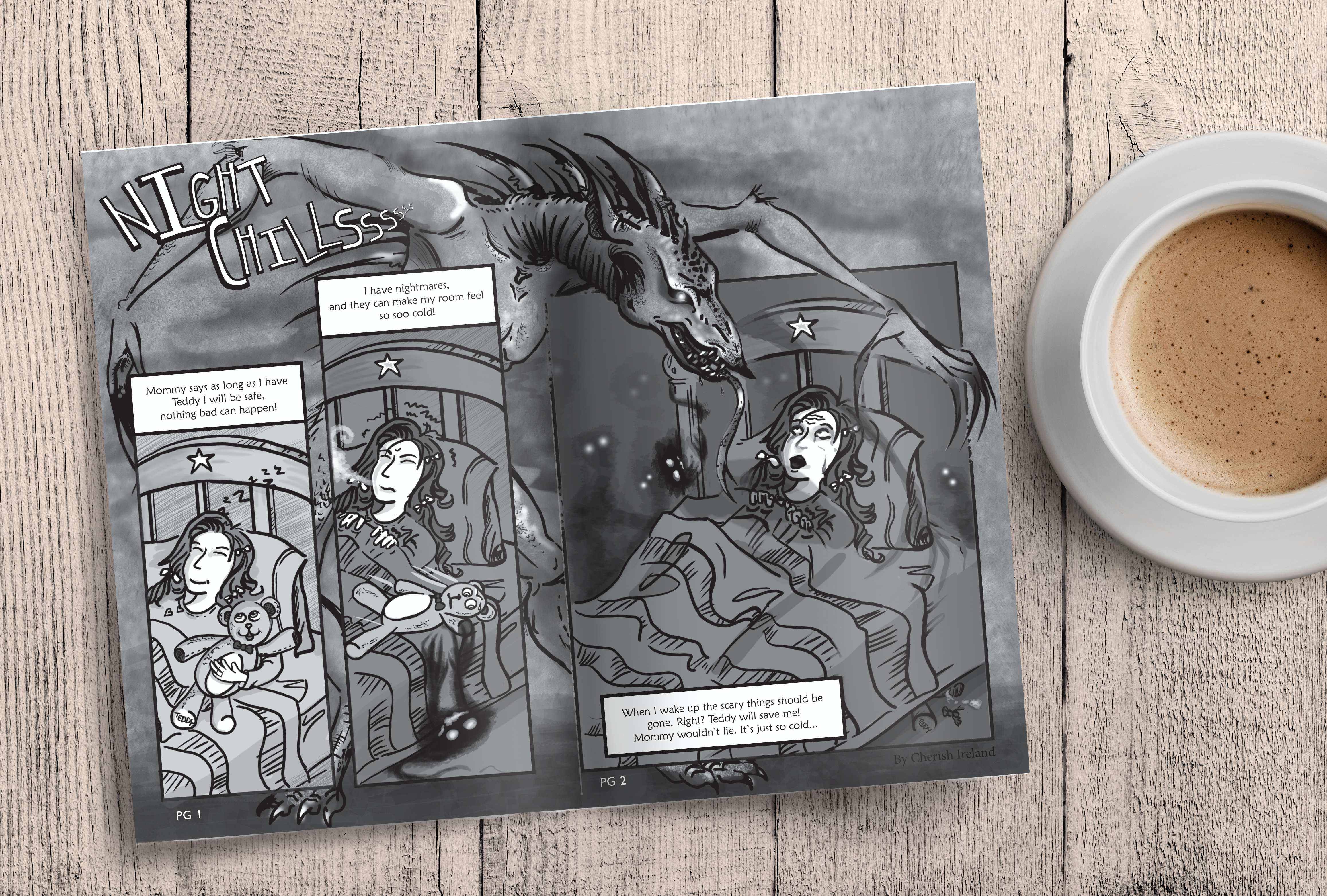
The story capture the moment a treasured teddy bear, and protector was stolen from a little girl in bed. The 3 panels feature transition from light and safe, to moody and spooky. The second shows the teddy falls into the grips of a monster under the bed. Finally with her protector removed, the showdows sweep in and a monster looms overhead.
Cover Design
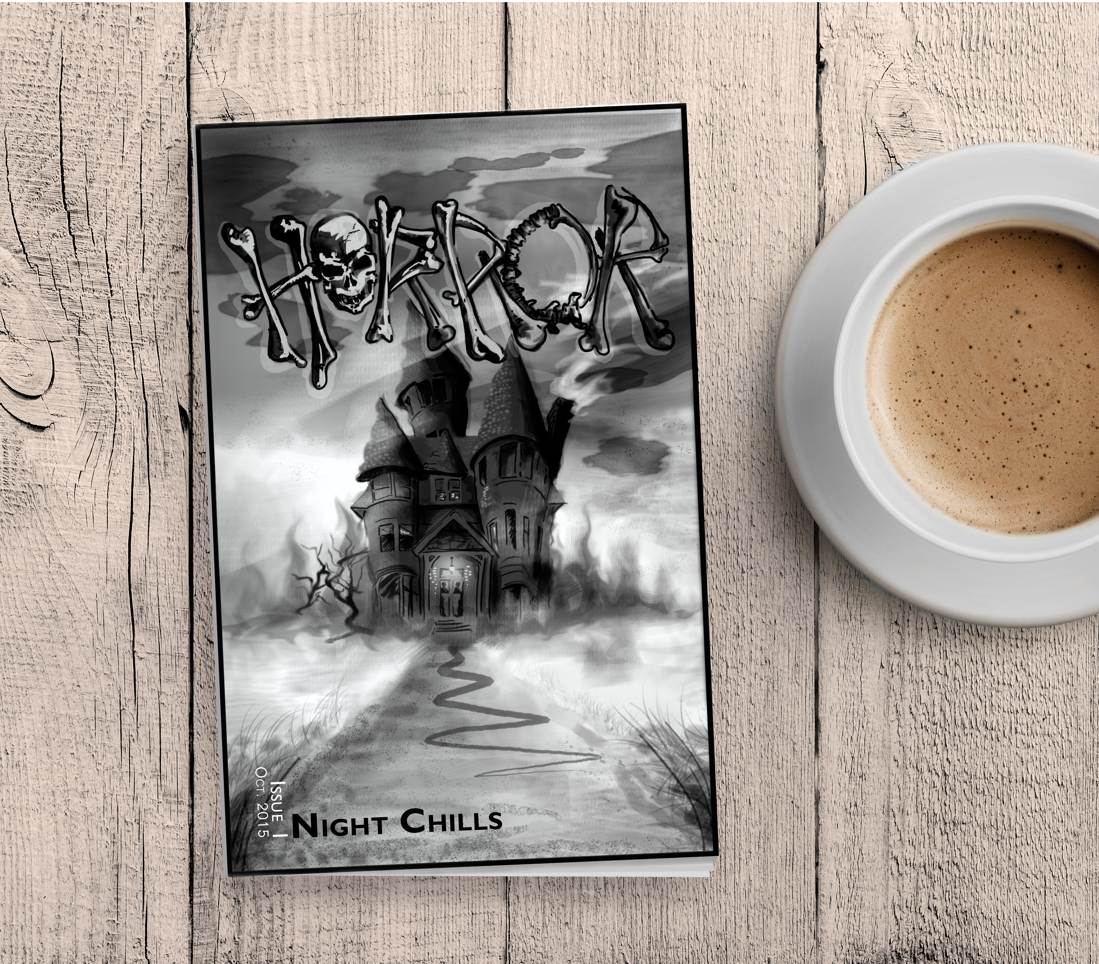
The cover was to feature a illustration that would work with many other contributing artists. I wanted the typography and image to look inked and smudged and foggy. I took inspiration from horror movie covers and novels.
I took a typeface and adapted and illustrated it to meld it with the cover art. I created my own letters to incorporate more complex bones. I used leading lines to draw you in. I kept the typography for the issue minimal and let the issue theme take the lead.



The Rough Work
I began with some sketches, then moving to Photoshop to create the illustrations. I finished the project in InDesign to set my copy.
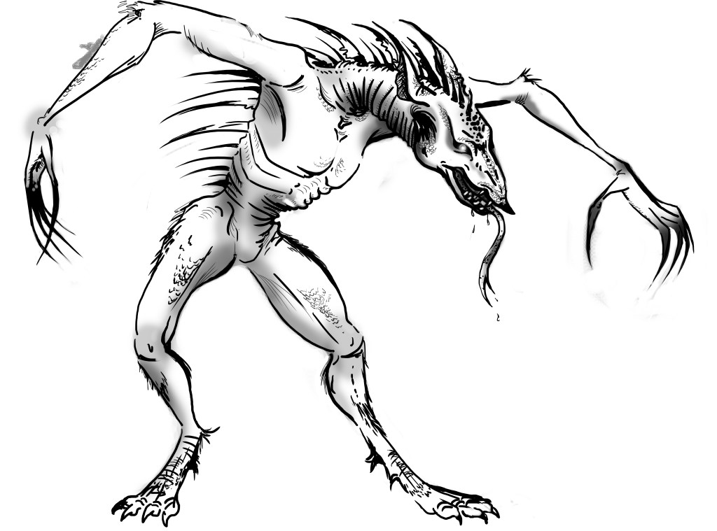
Original illustration: I wanted to create a cross between a wolf and tall man with elongated limbs.

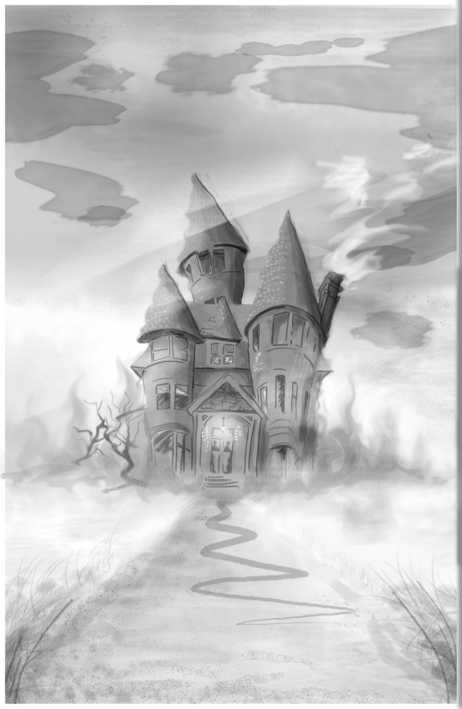
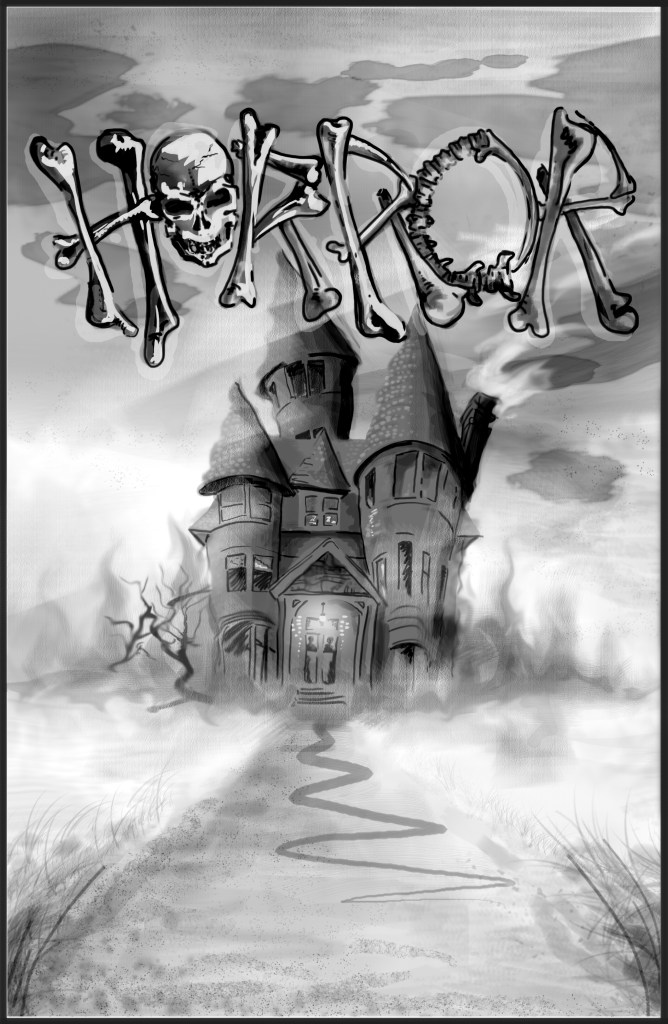
I’m happy with the end product, making something spooky is always very fun for me. With more time I would have improved a few things like the balancing and values of the cover. I would have also made more interest and tension in the cover page typography for the Zine issue details.

